Redirecting to new Blog
Creating 3D charts using Silverlight 3.0
In this blog I will show you how to create 3-Dimensional chart using Silverlight 3.0 and Microsoft expression blend.
Silverlight is known for its jazzy look and feel. This blog will help to make the Silverlight charts more eye-appealing and jazzy.
Prerequisites: Silverlight beginners and should have basic knowledge about Silverlight and XAML coding.
.
Getting Started with Silverlight Environment:
You need to have the following tools installed in your system to start with Silverlight.
Ensure that you have either Visual Studio 2008 SP1 or Microsoft Expression Blend installed as it is a prerequisite for the Silverlight Tools.
Note : Microsoft expression blend is an add-on tool that is not necessary for creating Silverlight 3D charts it is just a tool used to create the style which can be further used in the project.
Please refer the following link for more information, on required tools and installation process of Silverlight.
1. Creating a Silverlight Application - Opening a new project in Microsoft Expression Blend
Open Microsoft Expression Blend > File > New Project >Select the project type as “Silverlight 3 application” > Select the language (C# or VB) > Give the Name as “Silverlight 3D Charts” > Click OK.
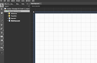
You will see that project is created: Silverlight 3D Charts with MainPage.xaml as a startup page.
2. Understanding the concept
First we will create a chart with the column data series. By default, Silverlight have a style of 2D chart style. We will edit the ColumnDataPoint style of the column series to make it look like 3-Dimensional.
3. Creating static Chart using XAML coding
First we will create a simple chart. Go to the assets tab and drag and drop the chart item from it on the MainPage.xaml
It will create a chart with the Column Series, as shown in the figure.
You can edit the chart properties like title, width, height etc from the xaml view.
Change the properties of the Chart to following values to make the chart viewable.
Title="3D Chart" Margin="0,0,0,0" Width="600" Height="400"
4. Changing Style of Columnseries
Now Right Click on the columnseries in the design view go to Edit Additional Templates > Edit Data Point Style > Edit a Copy
It will open a “Create Style Resource” dialog box, give the name (Key) as 3DColumnDataPointStyle and click on Ok.
Now as shown in the figure below Column Data Point style is available for editing. It will generate the style in the xaml under the
<Style x:Key="3DColumnDataPointStyle" TargetType="chartingToolkit:ColumnDataPoint"> tag.
This is one unit of column shown as a rectangle. Now to make it 3D view we have to add two rectangles viz one on the top and one on the right. Refer the figure below.
To generate such two triangles add the following lines inside the Grid
<Rectangle Fill="{TemplateBinding Background}" Stroke="#ccffffff" Width="22" HorizontalAlignment="Right" Margin="0,0,-22,0" RenderTransformOrigin="0, 0.5">
<Rectangle.RenderTransform>
<TransformGroup>
<SkewTransform AngleY="-40"/>
</TransformGroup>
</Rectangle.RenderTransform>
</Rectangle>
<Rectangle Fill="{TemplateBinding Background}" Stroke="#ccffffff" Margin="0,-20,0,0" Height="20" VerticalAlignment="Top" RenderTransformOrigin="0.5,1">
<Rectangle.RenderTransform>
<TransformGroup>
<SkewTransform AngleX="-50"/>
</TransformGroup>
</Rectangle.RenderTransform>
</Rectangle>
Now if you click on the User control in the Design view you can see that our 3D chart is ready.
5. MainPage.xaml
Your MainPage.xaml file will look similar to this.
|
<UserControl
xmlns="http://schemas.microsoft.com/winfx/2006/xaml/presentation"
xmlns:x="http://schemas.microsoft.com/winfx/2006/xaml"
xmlns:chartingToolkit="clr-namespace:System.Windows.Controls.DataVisualization.Charting;assembly=System.Windows.Controls.DataVisualization.Toolkit" xmlns:d="http://schemas.microsoft.com/expression/blend/2008" xmlns:mc="http://schemas.openxmlformats.org/markup-compatibility/2006"
x:Class="Silverlight_3D_Charts.MainPage"
Width="640" Height="480" mc:Ignorable="d">
<UserControl.Resources>
<Style x:Key="3DColumnDataPointStyle" TargetType="chartingToolkit:ColumnDataPoint">
<Setter Property="Background" Value="Orange"/>
<Setter Property="BorderBrush" Value="Black"/>
<Setter Property="BorderThickness" Value="1"/>
<Setter Property="IsTabStop" Value="False"/>
<Setter Property="Template">
<Setter.Value>
<ControlTemplate TargetType="chartingToolkit:ColumnDataPoint">
<Border x:Name="Root" Opacity="0" BorderBrush="{TemplateBinding BorderBrush}" BorderThickness="{TemplateBinding BorderThickness}">
<VisualStateManager.VisualStateGroups>
<VisualStateGroup x:Name="CommonStates">
<VisualStateGroup.Transitions>
<VisualTransition GeneratedDuration="0:0:0.1"/>
</VisualStateGroup.Transitions>
<VisualState x:Name="Normal"/>
<VisualState x:Name="MouseOver">
<Storyboard>
<DoubleAnimation Duration="0" Storyboard.TargetName="MouseOverHighlight" Storyboard.TargetProperty="Opacity" To="0.6"/>
</Storyboard>
</VisualState>
</VisualStateGroup>
<VisualStateGroup x:Name="SelectionStates">
<VisualStateGroup.Transitions>
<VisualTransition GeneratedDuration="0:0:0.1"/>
</VisualStateGroup.Transitions>
<VisualState x:Name="Unselected"/>
<VisualState x:Name="Selected">
<Storyboard>
<DoubleAnimation Duration="0" Storyboard.TargetName="SelectionHighlight" Storyboard.TargetProperty="Opacity" To="0.6"/>
</Storyboard>
</VisualState>
</VisualStateGroup>
<VisualStateGroup x:Name="RevealStates">
<VisualStateGroup.Transitions>
<VisualTransition GeneratedDuration="0:0:0.5"/>
</VisualStateGroup.Transitions>
<VisualState x:Name="Shown">
<Storyboard>
<DoubleAnimation Duration="0" Storyboard.TargetName="Root" Storyboard.TargetProperty="Opacity" To="1"/>
</Storyboard>
</VisualState>
<VisualState x:Name="Hidden">
<Storyboard>
<DoubleAnimation Duration="0" Storyboard.TargetName="Root" Storyboard.TargetProperty="Opacity" To="0"/>
</Storyboard>
</VisualState>
</VisualStateGroup>
</VisualStateManager.VisualStateGroups>
<ToolTipService.ToolTip>
<ContentControl Content="{TemplateBinding FormattedDependentValue}"/>
</ToolTipService.ToolTip>
<Grid Background="{TemplateBinding Background}">
<Rectangle>
<Rectangle.Fill>
<LinearGradientBrush>
<GradientStop Color="#77ffffff" Offset="0"/>
<GradientStop Color="#00ffffff" Offset="1"/>
</LinearGradientBrush>
</Rectangle.Fill>
</Rectangle>
<Rectangle Stroke="#ccffffff" Fill="{TemplateBinding Background}" Width="22" HorizontalAlignment="Right" Margin="0,0,-22,0" RenderTransformOrigin="0,0.5">
<Rectangle.RenderTransform>
<TransformGroup>
<SkewTransform AngleY="-40"/>
</TransformGroup>
</Rectangle.RenderTransform>
</Rectangle>
<Rectangle Stroke="#ccffffff" Fill="{TemplateBinding Background}" Margin="0,-20,0,0" Height="20" VerticalAlignment="Top" RenderTransformOrigin="0.5,1">
<Rectangle.RenderTransform>
<TransformGroup>
<SkewTransform AngleX="-50"/>
</TransformGroup>
</Rectangle.RenderTransform>
</Rectangle>
<Border BorderBrush="#ccffffff" BorderThickness="1">
<Border BorderBrush="#77ffffff" BorderThickness="1"/>
</Border>
<Rectangle x:Name="SelectionHighlight" Fill="Red" Opacity="0"/>
<Rectangle x:Name="MouseOverHighlight" Fill="White" Opacity="0"/>
</Grid>
</Border>
</ControlTemplate>
</Setter.Value>
</Setter>
</Style>
</UserControl.Resources>
<Grid x:Name="LayoutRoot" Background="White">
<chartingToolkit:Chart Title="3D Chart" Margin="0,0,0,0" Width="600" Height="400" >
<chartingToolkit:Chart.DataContext>
<PointCollection>
<Point>2,10</Point>
<Point>3,20</Point>
<Point>4,30</Point>
<Point>5,40</Point>
</PointCollection>
</chartingToolkit:Chart.DataContext>
<chartingToolkit:ColumnSeries DependentValuePath="X" IndependentValuePath="Y" ItemsSource="{Binding}" DataPointStyle="{StaticResource 3DColumnDataPointStyle}"/>
</chartingToolkit:Chart>
</Grid>
</UserControl>
|
6. Output
Goto Project > Run Project (F5) It will show the output in the browser as below
7. Other Key Features
1. You can add this style to any column series by pointing the style key name as DataPointStyle="{StaticResource 3DColumnDataPointStyle}" and it will use this style effect and render as 3D chart. Ideal practice is to keep all the styles in App.xaml.
2. You can make the chart more stylish by changing the color, border color, adding gradient to the chart color. The newly Style generated allows us to deal with the chart style at the primitive stage.
3. One can use the style palette if there are more than one column series in the chart. Chart control will use the colors from the style palette alternately to display the each series with the unique color. Refer the figure below.
4. One can create the 3D bar chart using the same logic and it will look like following.
References
Web content composed with the free online HTML editor. Please purchase a membership to remove promotional messages like this.


No comments:
Post a Comment